Resurs Bank
Objective: create a checkout that merchants and consumers loves.
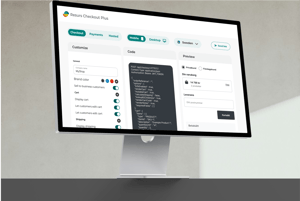
Before re-design
Desktop view of Resurs Checkout with the 3-column layout.
Market and Competitive Analysis
The first step in my assignment was to analyze how Resurs Bank's checkout compared to its competitors. I conducted all the research and documentation, regularly checking in with the design lead and product owner. The aim was to establish a baseline that would serve as the target for the development of the new solution.
I started by thoroughly researching checkout solutions and other digital financial services from competitors, both Swedish, Nordic, and European. I created accounts on the services and reviewed a large number of e-commerce checkouts, taking screenshots of the most important flows. I then did the same with Resurs Bank's own digital services.
In parallel, I contacted nine individuals who were either current customers of Resurs Bank, potential customers, or former customers, as well as representatives from three e-commerce platforms. I conducted one or two interviews with these individuals, asking them what they thought of Resurs Bank's services, their strengths and weaknesses, and why they would choose another provider over Resurs Bank.
I structured the responses from my own analyses and interviews into two main sections: Customer Experience and Providers. In the Customer Experience section, I reviewed the user experience in an e-commerce purchase, focusing on the checkout and payment experience. Here I compared the different apps and services based on Nielsen's heuristic evaluation model and its ten rules for good usability. If possible, I also made direct comparisons between how Resurs Bank's checkout stood up against comparable services from competitors. To facilitate reading, I highlighted quotes from my interviews and important conclusions in colored boxes with icons.
In the second section, I provided an extended summary of the most important competitors for Resurs Bank. In addition to describing their solutions and providing visual examples, I also included quotes from the interviews to convey how customers and platforms perceived them.
Finally, I wrote a summary reflection and conclusion. In it, I listed seven points that the future checkout needed to address to at least reach the level of its competitors.
The report was then distributed within the organization and became a foundation for next steps.

Prototyping
In the next step, I, together with the product owner and development team, reviewed the current checkout solution to see what we could do to quickly improve the user experience.
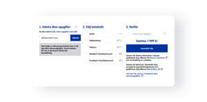
The current solution was based on a three-column layout for large screens and a one-column layout for small screens. It requested the customer's personal identification number directly but did not provide sufficient clear information on how it would be used or stored. There was also a risk that it could exclude customers who wanted to pay by card or Swish and did not want to provide their personal identification number. The form was also unnecessarily cumbersome and took up a lot of space, which particularly impaired the mobile experience.
The current solution also made it difficult for the user to understand how to navigate between the different steps in the checkout; 1) Identification, 2) Payment method selection, and 3) Complete purchase. Another challenge was if the customer wanted to specify a different delivery address, especially if the address had been retrieved from the personal identification number.
In this exploratory phase, I created many alternative sketches and prototypes that I continuously shared with the team for feedback. The weekly scheduled Design Studio meetings with the team and other stakeholders helped maintain continuity and keep the entire team involved. It was important at this stage that the new design did not require any backend changes because we wanted to launch the update as soon as possible.

User testing
When we felt we were approaching a new design that we believed would both improve the user experience and increase conversions without requiring significant code changes, we went out and tested the prototype with potential users of the checkout.
We conducted two types of tests: 1) Digital surveys via Usability Hub (Listen) and 2) Interviews and individual tests of our prototype.
In the digital survey, we tested step 1, identification, where the customer enters their details and address. Our initial hypothesis was that customers would appreciate having their information saved automatically, with the option to set this up via a separate screen. The result was the opposite; 84% indicated that they wanted to actively choose to save their information.
Our second hypothesis was that customers wanted to simplify the input of their address by providing their personal identification number. The result was less clear, but 42% chose the design without a personal identification number field, while 30% chose the one with it.
Of those who responded that they shopped online "sometimes" or "often," 100% chose the design with the active choice to save information and without a personal identification number field.
The individual interviews and tests of our prototype reinforced these results and gave us confidence to continue on the path we had chosen: to make the checkout more streamlined, clear, and transparent.

Launch

A/B testing
Once the new solution was in production, we started several A/B tests to see if we could further improve the conversion rate. We were mainly interested in understanding how the way we presented the different payment methods affected the choices customers made. Our hypothesis was that if we presented the cost of the product per month for installment payments, customers would be more likely to choose the installment option as the information removed
some uncertainty about the total cost of credit purchases. The result showed that the different variants only differed by a few percentage points and sometimes only by a tenth of a percentage point. The variant where the cost of purchase was presented to the customer gave a slightly higher overall conversion rate, so the team decided to proceed with this variant.
Re-design
At this point, we had launched the new checkout, but it still lacked functionality to compete with its competitors, including not having a shipping selector and having limited ability to communicate with merchants’ e-commerce systems. This made it impossible for the merchant to, for example, display messages to the customer depending on which products were in the cart or which payment methods they chose.
The decision was made to start the work of rebuilding the checkout from scratch.
Workshops
When the goal was to develop a completely new checkout, we needed to go back and review the product strategy. The first step was therefore to gather all stakeholders in a series of workshops. I was responsible for planning and conducting these workshops, in close collaboration with the product owner. Internal staff participated, including product leaders, customer service staff, salespeople, marketers, analysts, lawyers, and architects, and the result was a list of things the company and/or product should continue, stop, or start doing.
Some of the key points for the design of the new solution:
- The checkout must support online commerce as well as businesses that want to "push" the checkout for online payment during visits, such as at the dentist or workshop.
- The checkout must be able to create a deeper connection with merchants and platforms.
- All payments should be able to be made inline, i.e., without having to send the customer to new pages via redirects.
- The checkout must be able to offer a shipping selector.
- The target group is small and medium-sized businesses that do not need custom-developed checkout flows.
Customer Interviews
Based on this, I conducted 18 in-depth interviews with both merchants, current and potential customers, and e-commerce platforms. All conversations were conducted digitally, and I always made sure to record them and have a colleague with me. When possible, I always invited customer managers or salespeople to the meetings.
The setup was to first ask them about their biggest challenges as merchants, and I was careful to explain that we were not just looking to hear that our checkout was good or just hear about challenges related to the checkout flow. On the contrary, we wanted to get a good overall picture of their combined problems and challenges.
It was important to emphasize that this was not a sales call but an opportunity to hear their honest opinions. Therefore, questions like "Tell us what you think works worst with our solution?" and "Would you rather choose a solution from Company A instead?" were asked.
In this context, it was good to have salespeople in the conversations to hear the merchants' opinions without having to "sell" themselves. They also got to hear another side than what usually emerged in sales calls.
After the initial general questioning, the interviewee and I reviewed their own e-commerce to jointly examine what worked well and poorly and specific wishes on how they wanted it to work.
This gave us a very detailed picture of the merchants' combined needs, which the new solution had to meet:
- Reliable and able to capture errors.
- Flexible and able to support multiple customer journeys, e.g., sales to businesses and international customers.
- Dynamic and able to update according to changes.
- Complete and also offer a shipping selector.
User Story Mapping
With these insights, the team gathered for a two-day workshop where we, together with product owners, architects, developers, and testers, created a user story map. Since the current onboarding process was entirely manual, we included this step in our work to cover all steps, from when the customer explores the services on the website, when they want to test the product, all the way to production and customers placing orders and receiving payment confirmation.
This method made it clear to everyone on the team that we were talking about the same things, making it easier for everyone to have opinions and influence the design. It also made it easy to develop alternative solutions for the same step and choose the solution that was most efficient and easy to implement in a first version.
Key conclusions after this phase:
- To offer a complete solution, we decided to include a shopping cart in the checkout, especially for customers who used a plug-in for their e-commerce system.
- We would implement a shipping selector.
- The user would be able to navigate between the different steps with the information saved.
- We would include other checkout features such as checkboxes for newsletters and discount codes.

Design & prototyping
Now we had a good material to start designing the new solution.
An important result of the mapping was that we could easily explore alternative flows now that we knew how all the steps connected and what needed to come before and after each other. Traditionally, all identification is done in the first step, but after making some initial sketches, we became increasingly convinced that it was better to place the identification after the user had chosen the shipping method and payment method. Then we could dynamically present the required form to complete the purchase. If the user chose home delivery and direct payment via mobile, we only needed to ask for email and mobile number.
In addition to the checkout solution itself, we decided to also start designing a landing page for the product on the public website and a support portal for developers and merchants that would offer detailed documentation of the product, a sandbox environment for developers to test and configure the solution.
We continuously tested the design and prototypes with users.


Read more
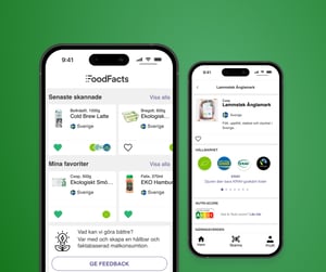
Mårten är en senior produkt designer och produktutvecklare med över 15 års erfarenhet.
Read More
Ny tjänst i SEB's företagarportal Business Arena med digitiala onboardingflöden för produkter och tjänste från både SEB och externa partners.
Read More